There is one layout, but it can look like four completely different publications. The era decides everything: the fonts, the colours and how the photos are processed. Here is a short guide to each of the four decades.
Why the era matters at all
The era decides what a guest feels when they pick up the page: history, a retro mood, fun or the elegance of a modern magazine. The structure of the layout is the same in every era: the masthead, the main article and the guest’s photo. Only the design changes.
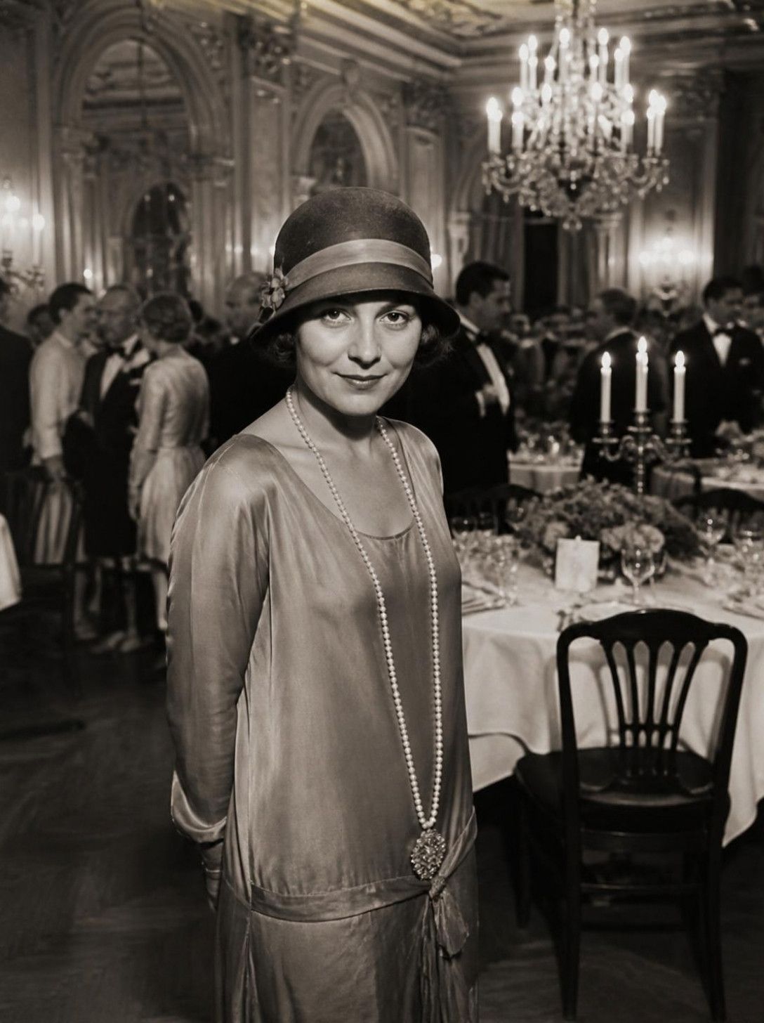
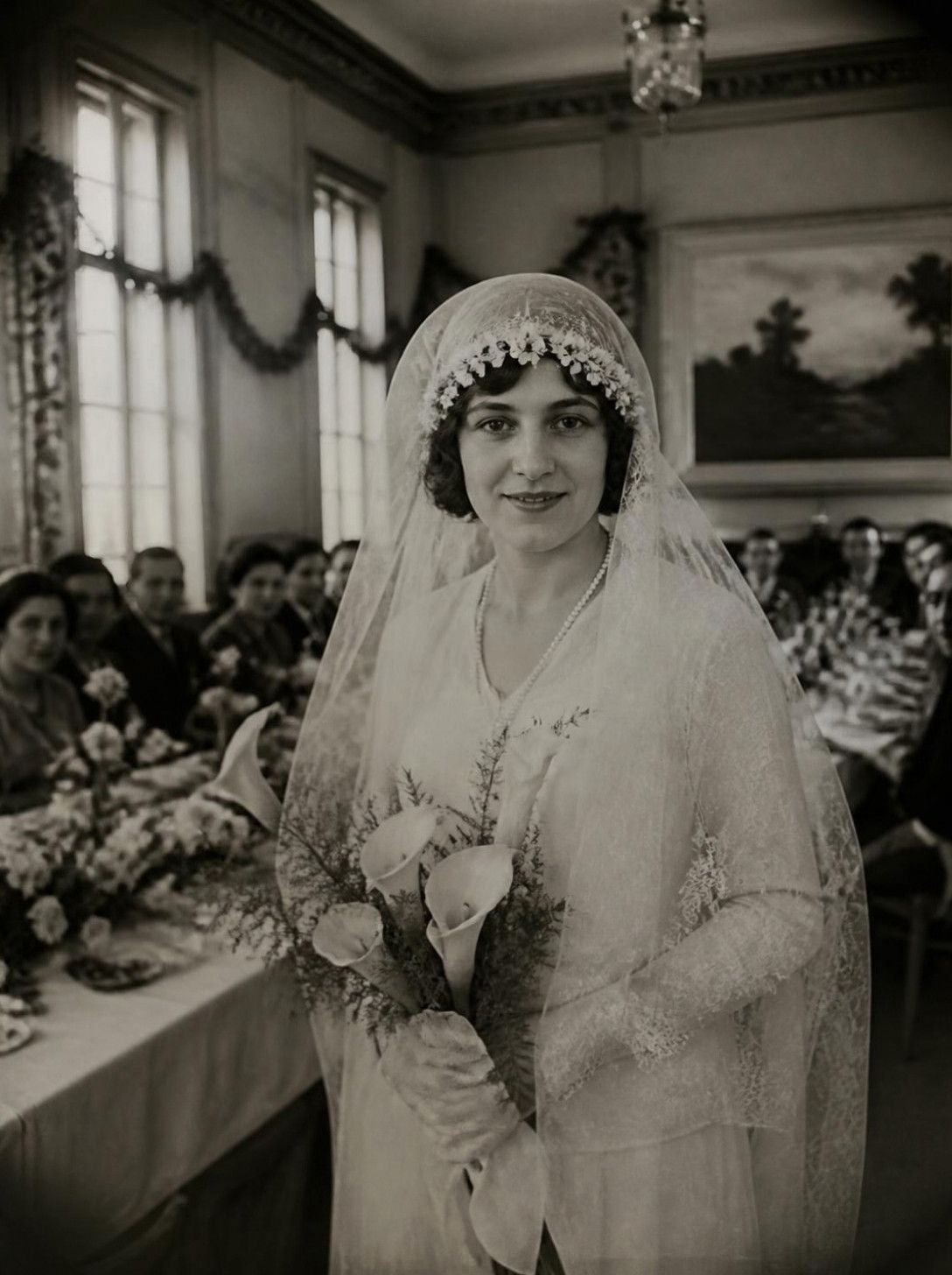
1925: the broadsheet
Art Deco, sepia and double rules. Right for classic weddings and lovers of history. The page looks like an edition kept in a museum, and the sepia tone makes portraits look soft.
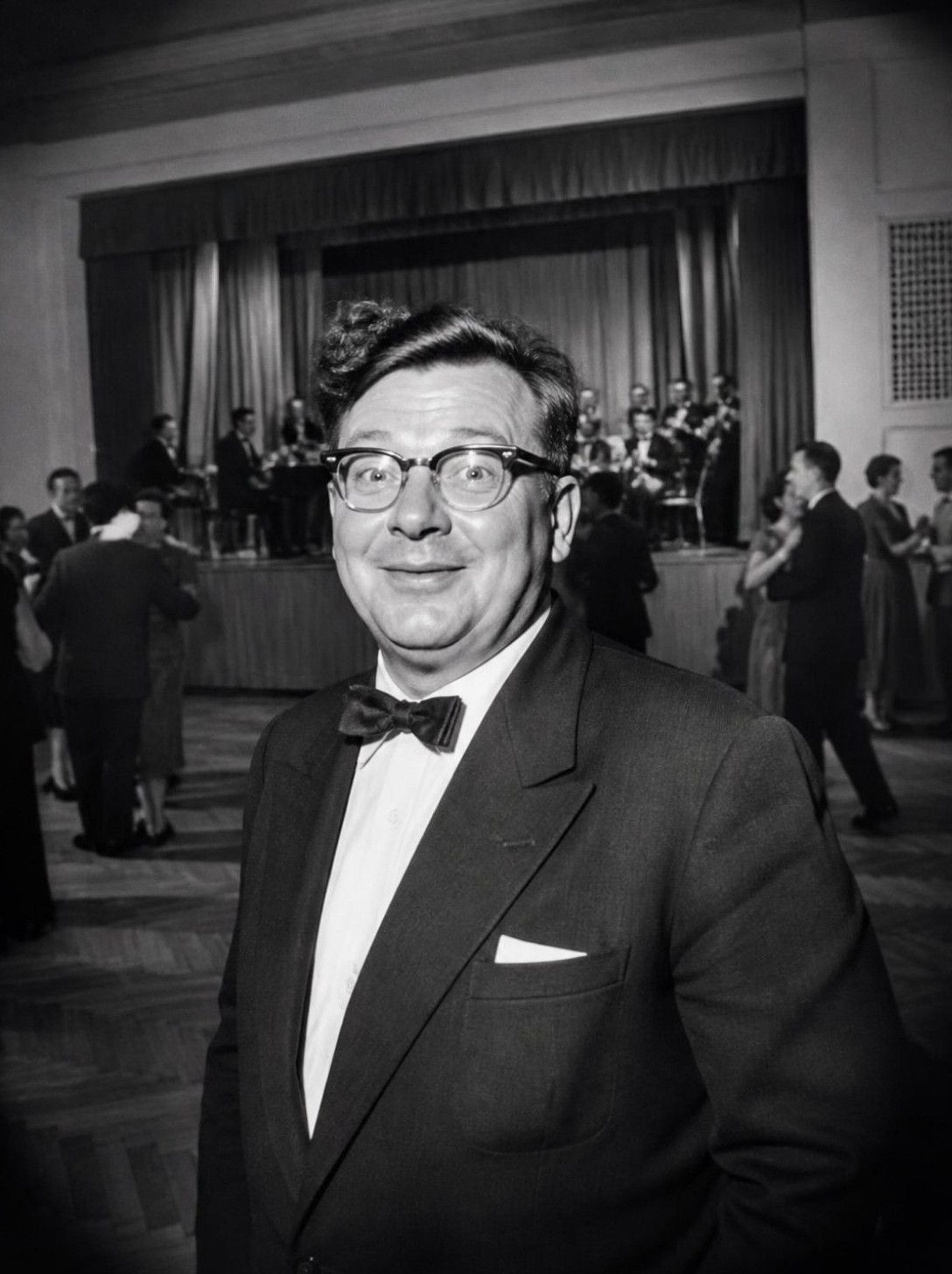
1958: mid-century
Two colours, halftone dots and bold headlines. Suits events with a retro theme and people who want style without noise. You can read a mid-century paper at a glance.
1987: the tabloid
A red masthead, loud headlines and bright photos. A good choice for parties and teams with a sense of humour. The headlines sound like sensations, and guests look like celebrities.
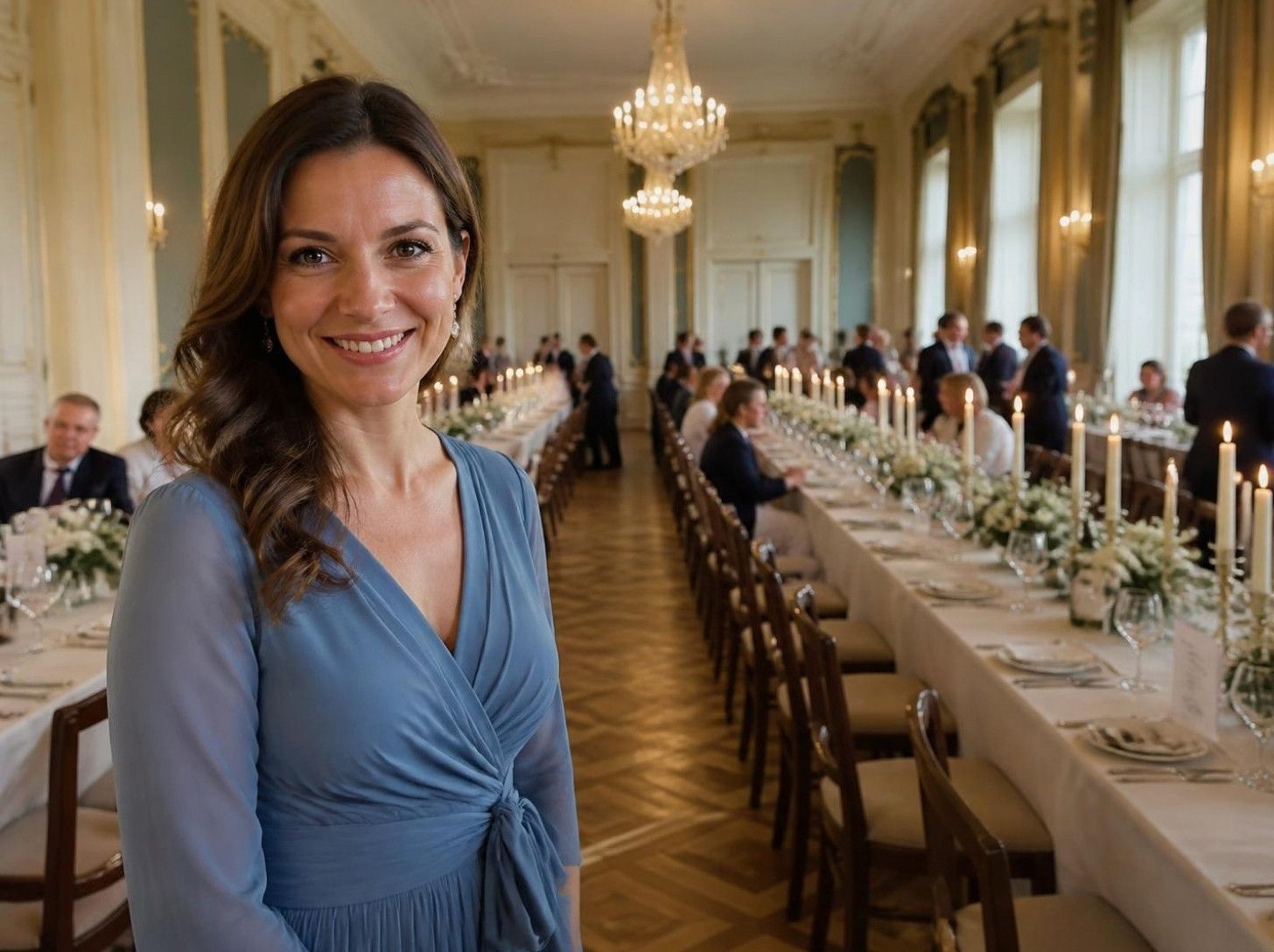
2026: the modern magazine
Plenty of white space, an elegant serif and clean photos. Often chosen for corporate events and modern weddings, where the souvenir should look like a page from a design magazine.
How to choose yours
A simple test: imagine which envelope would make your guests smile. If you cannot decide, ask for samples in the quote. We will prepare the layout in several eras, and you will see which one feels closest.